This article was originally posted on my old weblog on July 25th, 2009.
A couple of weeks ago, most of a darkroom fell into my lap. In fact, I got everything I needed except an enlarger. This got me thinking about a project I thought of a few years ago. What would happen if, instead of using an enlarger to expose the photo paper, you held it up to your monitor and turned it on and off really quick? Would you see the pixels? That would be awesome!
I ran down to the camera store and picked up some photo paper (Ilford Multigrade IV RC, which is a resin coated paper so it's easy to work with. Not that I knew that going in since I never developed photo paper before.) My print developer was supercharged caffenol (an instant coffee and vitamin C based paper developer), as described by Tom Overton on his caffinol page. The camera store was out of paper developer in anything other than five gallon jugs, so I went looking to see if I could use caffinol to develop paper, and lo and behold, si se puede. I used all chemicals at room temperature, which was 75 degrees in this case.
Here's the developer I used:
| Water | 8 oz |
| Washing Soda | 3 tsp |
| Instant Coffee Crystals | 6 tsp |
| Vitamin C (ascorbic acid) | 1 tsp |
You might think that developing with coffee would stain the image brown. Past experiments with developing film in caffenol showed me that including the vitamin C almost completely neutralized the coffee tone on the film. Of course, this is paper, not film, on the other hand, it's resin coated paper not fiber paper. Well, I never did try it without Vitamin C, but as you'll see, the combination of vitamin C and RC paper made any brown coffee staining almost non-existent.
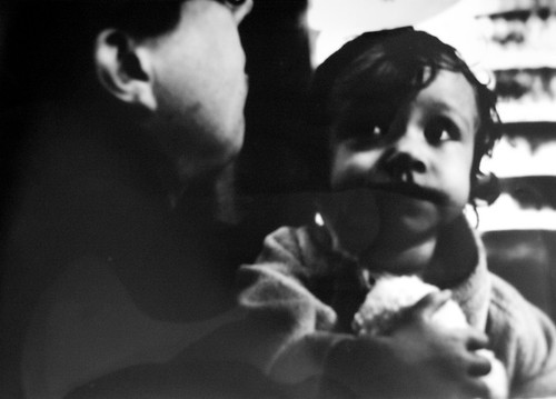
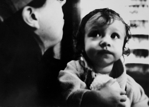
Here is the image I started with: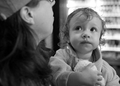
My first step was to export it from Lightroom, with a final output size of 7x5 inches at 100 dots per inch. Why 100 dots per inch? Because that's the DPI of my monitor (a 20 inch Apple Cinema Display). Then I imported it into the GIMP (a free image editing program similar to Photoshop) and used the Value Invert function to invert my image.
Ilford Multigrade IV is a photo paper that allows you to manipulate the final contrast of the image by varying the proportions of blue and green light in the light source used to expose the image. It has two emulsions, a blue sensitive high contrast emulsion and a green sensitive low contrast emulsion. More green light than blue and you get a lower contrast image, and vice versa. Of course, you don't have to think about proportions of light when you use it, all you have to do is use the appropriate gel filter to get the contrast you want.
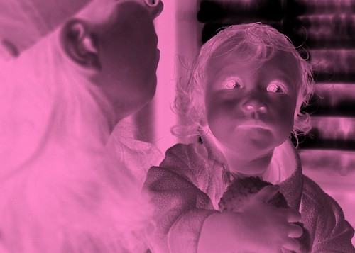
All that to say I had no idea what a black and white image would do for the contrast of my final print, so I decided to try coloring it the appropriate contrast grade color. I went with a target of Grade 2, which is middle of the road contrast and what Ilford says you should start with for a first time test print.
The first step was figuring out the RGB values for the filter. I did this by holding the filter in front of a white patch, and then varying the color of a color patch on the monitor until the two matched. I got a value of #FF87C8, or 255, 135, 200 if you're using decimal numbers. (Now, I since have learned that my contrast filters are old and were made for Ilford Multigrade II, not Ilford Multigrade IV, so keep that in mind if you are playing along at home, you may need to experiment a little.)
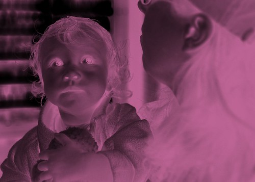
I then used the GIMP's "Colorify" filter to color my image. I don't know how to do this in Photoshop but it's bound to be easy and I'm sure you can figure it out with a little googling. Here's my image after coloring:
Now, if you know something about monitors you may be thinking "Yeah, but John, each pixel is like, a little square made of red, green and blue rectangles, so you're not really getting a pure magenta color! One part of the pixel will expose the green emulsion, one part will expose the blue emulsion, and one part will be white because neither emulsion is red sensitive!" Great point, and I completely forgot about that until after I was done with the whole project. Read on and you can see what effect that had on the final images.
So now I had my image ready. I cleared my desktop background of all icons (except for a couple I had to leave up, those I put at the extreme corners of the screen.) I minimized my task bar. Then I set my image as the background image of my desktop, set to Center the image, not tile or stretch it.
I then proceeded to make test strips, exposing the paper at 1, 2, 4, and 8 seconds. My foofy Apple monitor doesn't have a real physical on/off switch. It uses a capacitive touch panel for an on off button. A mere brush across it is enough to trip the switch, and it's not always precise when it actually turns on or shuts off. So my real exposure times were something like a little less than a second, about 2 and a half seconds, God only knows, and eight seconds. Yeah, I messed up the 4 second exposure by accidentally turning the monitor back on after I exposed the test strip.
I pasted a strip of the original next to the test strips so it's easier to compare them:
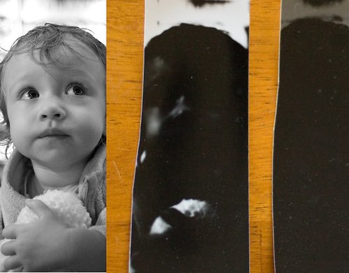
Oh well, it didn't matter since I could see that 2 seconds is way too long. I'm not even showing the 4 second and 8 second strips because they are completely featureless. Notice that I flipped the strip of original image horizontally to match the test strips -- I forgot to do that before I made the test strips. If you think about it you'll see why doing contact prints off the monitor will flip the image like that -- it's just like working with an old letter press.
Here I'm going to skip ahead a bit and tell you how to correctly interpret these test strips, rather than exactly do a play by play of how I interpreted them at the time, because how I did it was wrong.
See that second strip? Part of the image that should be pure white is actually dark grey. This is because my LCD monitor has a backlight, so even when it is black it is still emitting light, fogging the highlights. The first strip indicates to me that the exposure might be right but we have to tone the brightness of the image down, because it's overexposing the paper. The second strip is way too long.
When I saw these test strips for the first time, my first thought was that 1 second was still too dark, so I'll tone the brightness way down. I added a black layer behind my main image layer, and then decreased the opacity of my image layer to 25 percent. Now, if I had a normal LCD monitor, or an Apple monitor hooked up to an Apple computer, I could have adjusted the brightness and contrast of the monitor itself, instead of editing the image. Being able to turn down the backlight would be a huge benefit to experimenting with exposure times, but alas, that option was not available to me.
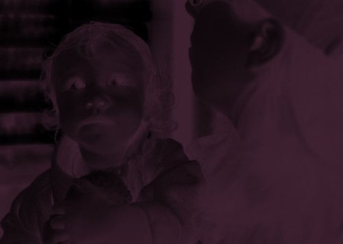
I tried a one second exposure with this image, but it came out so faint I didn't even bother fixing and rinsing the print properly. When I went to take a picture of it anyway, well, you can see what happened:
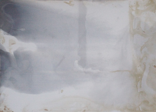
Before it darkened, you could barely see an image on the paper. "That's about four times too light," I thought to myself. "I'll try a four second exposure."
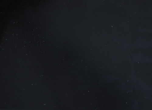
Well of course that was going to be too dark, and after this print I realized the real significance of the second test strip, as explained above.
I also did some more thinking. I'm really reducing the contrast range here, at 25 percent. Maybe I'll try 75 percent.
I first was going to do a half second exposure. So I flashed the monitor on and off as fast as I could once. Then I started second guessing myself so I gave it another brief flash.
Ugh! I should have stuck with test strips; I'm wasting paper like mad here. Notice the uneven development; I needed to get the pictures into the developer quickly and evenly, and obviously didn't do that here.
One flash (as fast as I could turn the monitor on and off, about a 1/4 to a 1/2 of a second) was just about right:
At this point I was only leaving the paper in the developer for 10-15 seconds. I was afraid that leaving the print in longer would darken the image too much, and maybe it would have, I have no idea.
Also please note that the original print has full white in the eyes and right above her head; it looks grey here because I forgot to set the white point on the final image before I uploaded it. And right now you're probably thinking "Wow, that's fuzzy!" Yep, each pixel "leaks" light into the neighboring pixels, which is why the RGB composition of each pixel doesn't matter so much.
How about a color image?
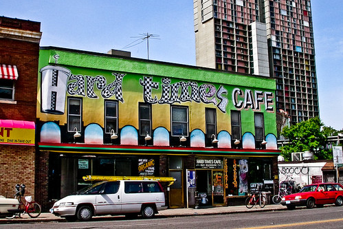
The real question is how to get a good inverted negative image. I used GIMP's "Value invert", which works great for black and white but completely destroys the color image. I did it anyway.
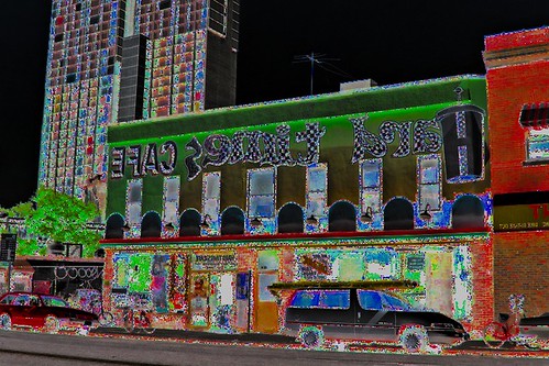
And the resulting image:
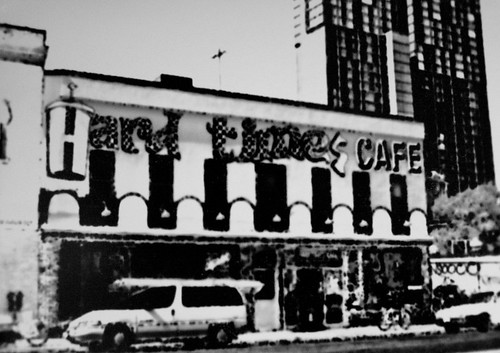
Here's a result w/a regular black and white negative image. Notice that I changed contrast grades, this is grade 0; #F0B475 or 240, 180, 117:
And the resulting image:
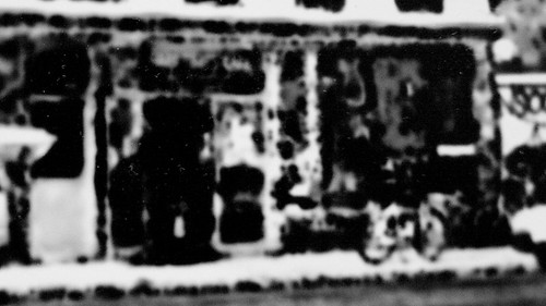
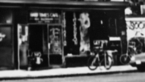
Here is a detail of the entrance in the lower right. First the original, then the color invert, then the black and white invert:
In conclusion? I don't have a conclusion. I'm still thinking about this. It certainly didn't come out like I had hoped or expected, but now that I see how it came out I might think of a use for it in the future. Please let me know if you try this and send me a link to your results!